Here’s another Strategy Cruncher question from Mugu (shared with permission).
Mugu:
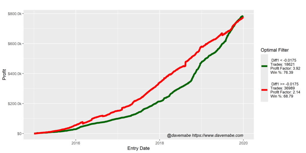
I am confused by my back test optimization results below regarding column Diff1:
How should I interpret this? It could be gold or bad data. Your thoughts?
Dave:
This is a situation that often confuses traders.
Notice the red line (the set of worst trades the cruncher found) was above the green line (the set of best trades), but they ended up with the same profit.
Aren’t these two strategies about the same? No!
Look closely at the number of trades in each line (look at the legend).
The green line achieves the same total profit as the red line with only HALF the trades.
The cruncher found a way to make your strategy far more efficient:
- Fewer trades with the same total profit
- Increase in profit factor to 3.92
- Increase in win rate to 76%
Think about the two strategies.
Which one gives you a better path to confidence to trade it eventually with significant size?
It should be pretty clear!
Thanks for the question, Mugu.
-Dave
P.S. When you’re ready to take your strategy to the next level, the Strategy Cruncher is here.