When backtesting, it’s easy to get lost in the data. What parameters lead to the most profitable overall strategy? Win rate? Profit factor? Expectancy? All these are, of course, important values to consider and often the most efficient way to backtest is to quickly compare these aggregate metrics.
While these summary stats are important, they necessarily hide a lot of the details about what’s contributing to your strategy. The best way to truly understand your strategy is to examine every trade on its own stock chart. With hundreds of trades in a backtest, though, that can be time-consuming and wasteful since most of the trades won’t yield any new insight.
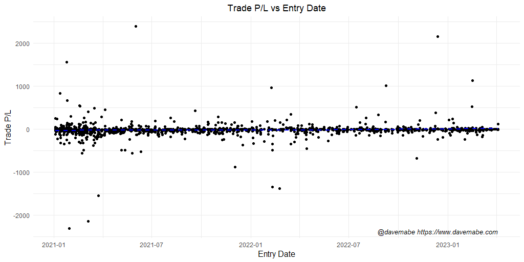
You can use an equity curve to visualize these by looking for bumps in the curve, but it will be far more subtle and harder to identify. If there are a lot of trades in your backtest, these bumps might be impossible to detect.
A better way to very quickly visualize all your trades in a backtest is using a scatterplot chart. This allows you to see the outliers at a glance – your eyes are quickly drawn to them. Instead of looking through every chart, you can focus on the trades that are most likely to lead you to insights to improve your trading strategy.
Now that you’ve identified the outliers, it’s time to figure out what to do about them. More on that soon.