
Too many trading indicators on a chart is a sign of mediocrity. Your charts should be nice and clean showing you exactly what you need to see to make your pre-planned decisions and no more.
Many traders take this to heart and have simple charts that aren’t littered with indicators, but too many draw the wrong conclusion at this point: that all indicators are worthless. A trader’s clean chart is not a recognition that all indicators are garbage – it should represent that the trader has gone through the thorough and painstaking work of determining which indicators are most important to their trading and why. It should represent countless ideas of what indicators make their trading tick and lots of decisions about the trade-offs of including or excluding certain ones. A simple chart should represent the quantifiable tests that have gone into determining which indicators contribute to profit.
Traders spend a lot of time focusing on the event that occurs to initiate a trade (for example, a new high). In Trade-Ideas we call these Alerts. What traders quickly realize, though, is that the filters you use to determine which new highs to actually trade and which ones to ignore are the most important part of a trading strategy.
A lot of traders trade stocks that reach new highs, but nobody trades ALL of them. Most of your time will be determining under which circumstances you take the trade and which ones you skip. This is the meat of your trading strategy and where you should spend the vast majority of your research time.
If you had to choose just one thing to improve in your trading process, it should be your routine for selecting filters. Improving your skills in filtering will compound over time and you’ll become better and better the more you do it. Your routine will become more efficient and you’ll quickly be able to get from a rough trading idea to an actual strategy that you’re ready to risk money with.
The Indicators I Use in Every Strategy I Trade
I have a consistent routine for evaluating and improving trading strategies. The most important part of this routine and where I think most of my personal edge as a trader comes from is determining which indicators to use in a strategy.
If you look across every strategy I’ve ever traded you’ll see lots of different indicators in use. You’ll also see some of the same ones appearing in a lot of them – some appear in every single one. Here’s the list of indicators (a.k.a. filters) most commonly appear in my strategies. When improving my models, these are the ones I look at first.
Volatility
Although some treat it as a generic term for movement, volatility has a very specific meaning at Trade-Ideas. It’s the amount the stock typically moves in a 15-minute period. Does it really matter what a stock does on a NORMAL day when strategies are typically looking for ABNORMAL activity? It turns out it has a big effect. Unusual activity with a stock eventually reverts back to its normal behavior and sometimes that can happen quickly. You’ll find that stocks that move more on normal days also move more on unusual days. If movement is what you’re looking for you should be looking at Volatility.
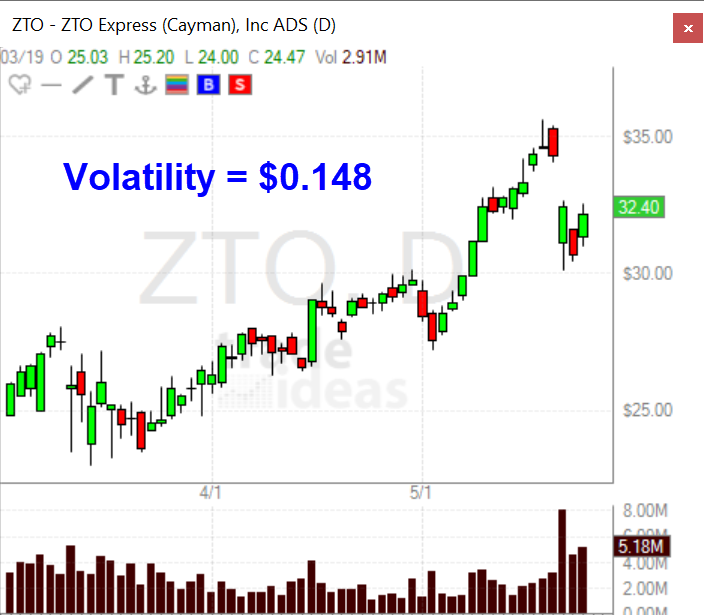
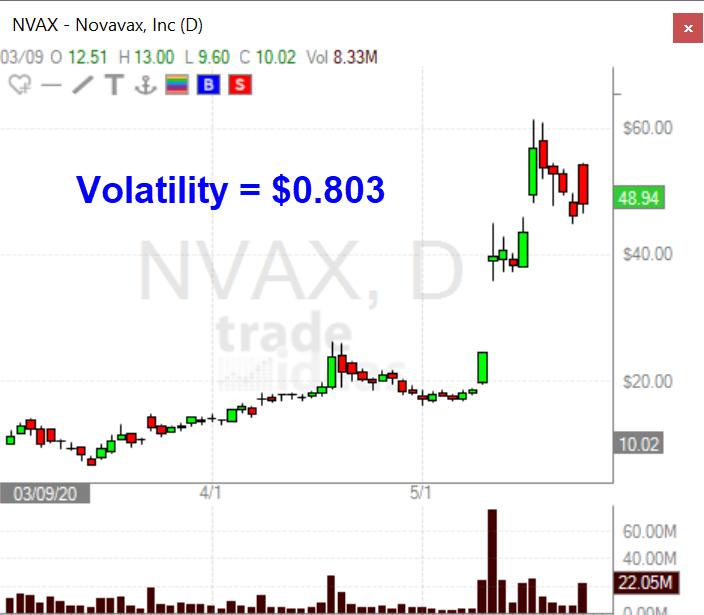
Take the two charts above. At first glance, these charts seem pretty similar, but when you look at Volatility, Novavax (NVAX) simply moves significantly more than ZTO Express (ZTO).
Relative Volume
Relative Volume is perhaps the most important filter of them all. Let’s say two stocks have traded a million shares so far today. If stock A normally trades 200,000 shares at this point in the day but stock B typically has traded 5,000,000 shares, stock A has a lot more interest from market participants than stock B, relative to what it normally trades. This is, of course, critically important to your trading system.
For stock A a continuation strategy probably makes perfect sense given the volume is unusually large, but for stock B the same amount of volume is unusually small. These are two completely different situations even though the shares traded are equal for the day for these two stocks. The value for Relative Volume alone could be the determining factor for choosing the direction you want to trade a stock.
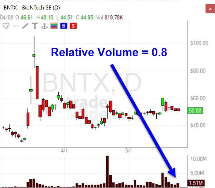
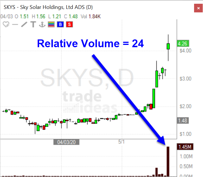
Take the above two charts. They both have almost the same shares traded on the same day, but the relative volume for BNTX is 0.8 while the relative volume for SKYS is 24. The calculation for Relative Volume at Trade-Ideas is perfect because it is aware of how many shares a stock trades throughout the day. For example, if a stock has an average daily volume of 500,000 shares and by 9:45 am it’s already traded 400,000 shares, the Relative Volume value recognizes that this is more significant than if the stock reaches 400,000 shares at 3:45 pm. You can read more about exactly how this indicator works here.
Gap %
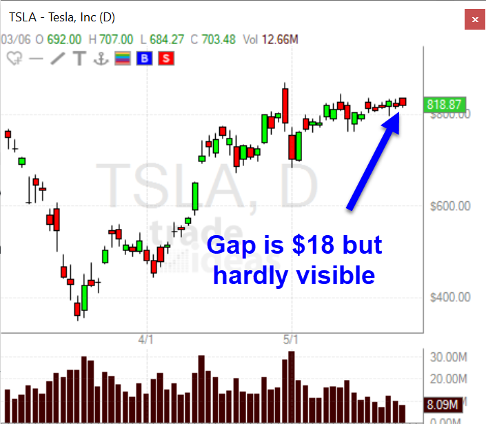
A lot of traders trade gapping stocks (including me). Stocks that have the potential for movement have very often gapped up or down at the open. But not all gaps are equal. Take this gap in TSLA yesterday. It’s over $18 but you hardly even notice it on the chart.
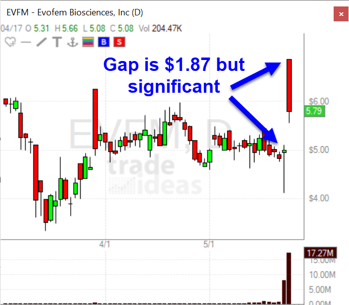
But then take a look at this gap in EVFM. It’s less than $2 but very significant when you look at the Gap percent.
I’ve backtested gaps for a long time and the value that keeps popping up as a good one to use as a starting point is 3.5 percent. When looking for gaps up, I start with a minimum Gap Percent of 3.5, and when looking for gaps down I use -3.5.
Average True Range (ATR)
The Average True Range (ATR) of a stock has a very specific definition. Like Volatility above, it captures typical price movement. So why do I have two indicators for price movement? They are highly correlated, so surely we can just choose one and simplify things, right?
It turns out there is a subtle difference between the two measures that is quite important for trading systems. The Average True Range is measuring the daily movement of a stock, while the Volatility is measuring the average movement during a 15 minute period. These numbers are highly correlated, but you do see stocks that have higher or lower volatility numbers relative to their ATRs and vice versa.
All things equal, the Average True Range will be a better indicator when applied to a trend type strategy where you’re holding a lot of the day or overnight. The Volatility indicator will be better when you’re trying to capture a shorter move on an intraday timeframe. I always look at both of these indicators when designing strategies. I’d encourage you to look closely at the definitions and understand what both of them represent.
Earnings Date
There are a lot of news items that can move a stock: upgrades, downgrades, share offerings, splits, etc. None are more consistently important than earnings announcements. Both investors and technical traders are focused on earnings so it’s bound to have an impact on your trading system. All things equal, stock movement due to recent earnings is more significant than movement for other reasons.
Trade-Ideas has a fantastic way to filter on Earnings Dates. I use it to determine which stocks are moving due to earnings and which ones are not. I also have scans that show me stocks that are reporting earnings after the close or the next morning.
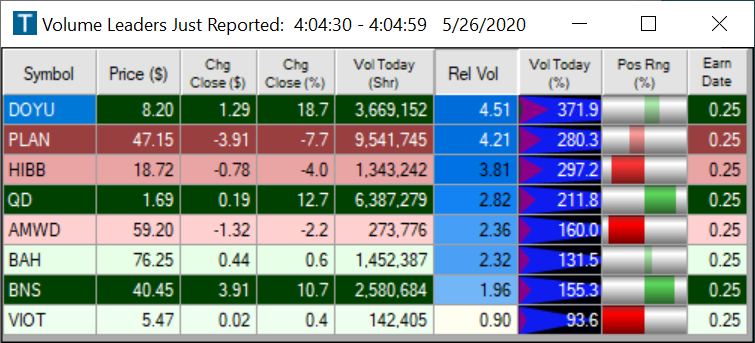
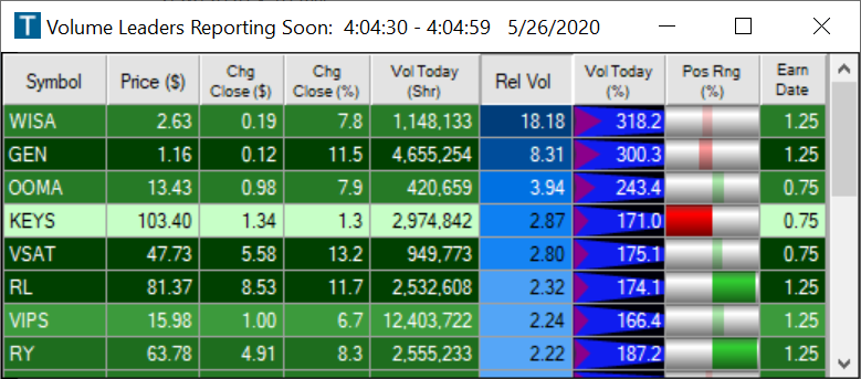
Here’s the cloud link for the Volume Leaders Reporting Soon top list I use and for the Volume Leaders Just Reported top list.
Position in Range
A stock’s position in its recent range has a huge impact on its future movement. Take a look at Morgan Stanley (MS).
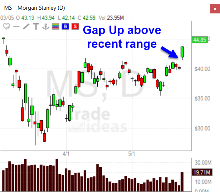
It gapped up above its recent range. But look at SL Green Realty Corp (SLG):
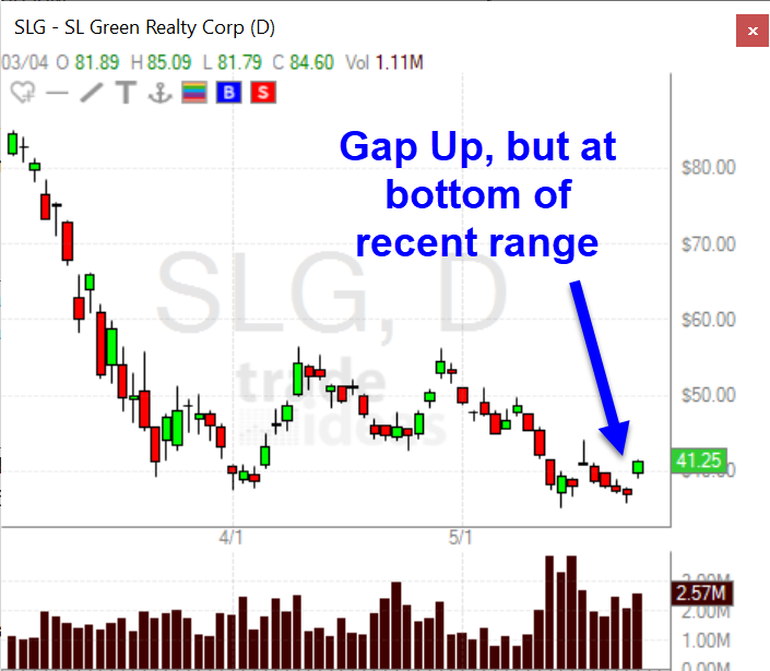
These are comparable gaps, but these stocks are in very different situations. MS gapped up well above its recent range but SLG is still very much at the bottom of its recent range. The recent trading range is very important to a stock’s future price movement and I always look at the Position in Range indicator when evaluating my trading systems. The time period for the range will vary based on the timeframe for your system. For an intraday trading system you should start with the position in today’s range but for longer term systems the position in yearly range might be more appropriate.
While I don’t use all these filters in each strategy I trade, these are definitely the ones I examine first when researching a new strategy. What are your go-to indicators for your trading systems?