If you don’t follow Steve Burns on Twitter, you should. He tweets all sorts of interesting market-related stuff. This one, though, made me do a double take:
"The larger the market gaps, the greater the odds of continuation and a trend." – @LindaRaschke
— Steve Burns (@SJosephBurns) December 3, 2018
This is one of those market “truisms” that everybody nods their heads to knowingly but very few people bother to verify.
Well, I like to verify things and not in a way to prove people wrong. Rest assured my motives are entirely selfish — if this statement is true then there’s an edge to be traded profitably. More often, though, by verifying things you end up learning something. Even if you can’t directly apply it to a trading strategy now, over years of research you’ll be able to pull from your growing library of market knowledge.
The reason I perked up at this particular tweet is because it runs counter to a lot of my research over the years on the behavior of the overall market. That is, there’s a LOT of mean reversion in SPY.
For the tweet to be true, we’d need to see the price close higher than the open after large opening gaps up and close lower than the open on days where there are large openings gaps down. Does that happen? Let’s take a look.
The Backtest
I ran a very simple backtest for the SPY:
- When the opening gap is greater than 0, go long at the open and exit at the close.
- When the opening gap is less than 0, go short at the open and exit at the close.
- When the gap is exactly zero, do nothing.
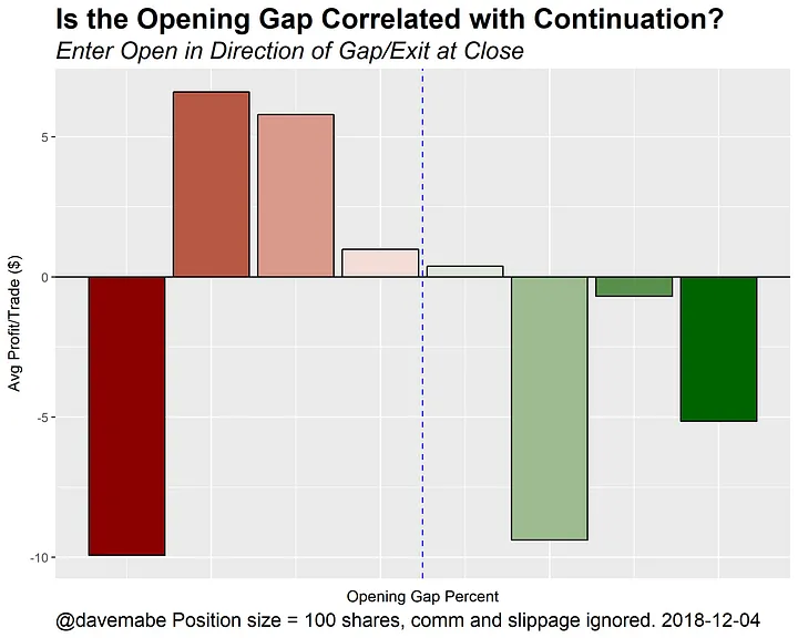
I also capture the Gap % for each day which will let us determine the correlation. The first thing I notice is that this is not a profitable trading strategy which is not surprising. A profit factor of 0.96, win rate of 49%, and an average profit of -$1.84 per 100 shares traded. But that’s taking every trade — let’s look at the size of the gap.

A quick glance at the chart and you’ll see that the bars on either edge are the most extreme gaps — the red one of the left represents the largest down gaps and the green one on the right represents the largest up gaps. If our original statement is true, we’d see bars going in the opposite direction on the ends of this chart — that is, they would extend above the zero line. We see literally the opposite of what the statement suggests we’d see.
OK, but What About Correlation?
When you work with enough backtests and statistical data, you quickly realize that you can be easily fooled by data. In fact, even in the chart above that the opening gap percent might be positively correlated with average profit per trade even though it appears as if it can’t possibly be. How?
We simplified our trade set by creating buckets for each level (range) of gap percent. When we do this we necessarily lose the full story. Correlations are strongly affected by extreme cases — exactly the cases that were collapsed into the bars on the left and right edges of the chart.
To determine correlation you need to look at the entire trade set — not just the buckets summarized in the chart. When you do, though, you see that the size of the opening gap is, in fact, negatively correlated with average profit:
- Correlation for gaps down: -0.033
- Correlation for gaps up: -0.016
What if we limit ourselves to only the more extreme gaps? In that case it gets even worse:
- Correlation for bigger gaps down: -0.084
- Correlation for bigger gaps up: -0.095
Again, we’d see positive numbers for these correlations if the original statement was really true — but we see the opposite.
So What Did We Learn?
By doing this, we learn a couple things. It reinforces the best advice I can possibly give any trader: don’t believe things at face value — do the work required to convince yourself it’s true.
The other takeaway is that while the correlations here aren’t strong enough to amount to a tradeable edge, they’re getting closer to that point. With some more work, this data suggests you could create a system that actually fades these strong opening gaps.