To trade intraday, you need to find stocks with the potential for movement. Gaps are one of the best ways to identify stocks that have that potential. On any given day there are typically plenty of gapping stocks to choose from — sometimes there can be an overwhelming number of them. We all have a finite amount of capital and time — how do you decide which gapping stocks are important?
You can use a filter for the dollar amount of the gap, say $2. This might work well for lower-priced stocks, but high-priced stocks like AMZN routinely gap $30 or more.
How about using a percentage of the previous close price? This is definitely a better approach and a common one that most traders make. (Gap % is one of Trade-Ideas’ most popular filters used in just over 10% of strategies.)
An Undervalued Approach to Gaps
While most traders stop at using Gap %, this approach leaves out valuable information that can help you determine just how unusual the gap is in a particular stock.
Some stocks are what I call “gappy” — that is, they routinely show up on my gappers scan when I use percentage as a threshold. In other words, an opening gap for some stocks just isn’t all that special. When it’s not unusual, it doesn’t attract other traders’ attention which is required for a stock’s price to move.
The next level for scanning for gaps is to use what is called Gap Bars. This looks at the gap not in dollars or percentage terms, but in terms of the particular stock’s normal volatility — how much it normally moves on a routine day. At first glance, you’ll notice that Gap % and Gap Bars are highly correlated, but there are subtle and valuable differences.
Here’s a great example from last Friday from my daily gappers list.
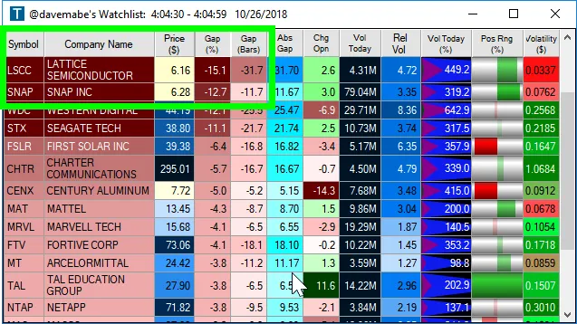
The first thing you notice is that these gaps look pretty similar. LSCC and SNAP were roughly the same price ($6.16 and $6.28) and the Gap % was in the same ballpark (-15.1% and -12.7%).
But when you look at Gap Bars they’re very, very different (-31.7 and -11.7).
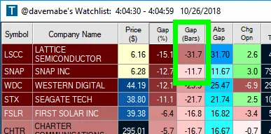
Look at the Charts
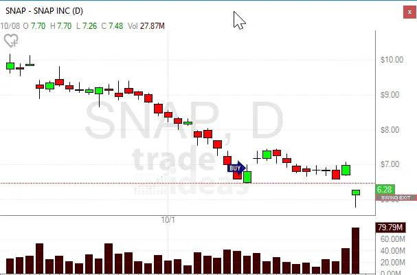
A quick glance at the charts and you’ll notice the subtle difference. The chart in SNAP shows that the gap is more routine in the context of the market action over the most recent several days.
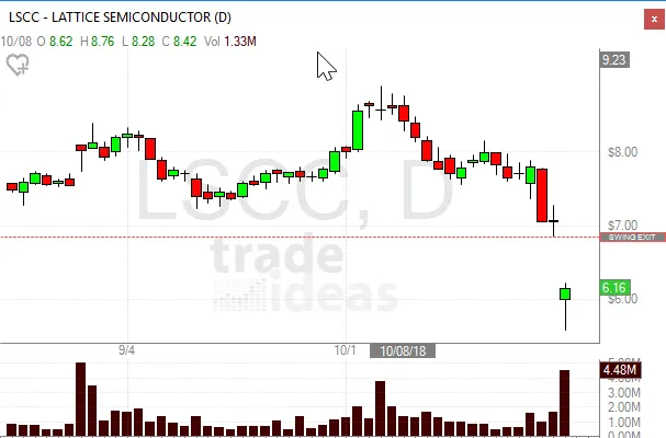
Compare this to the LSCC chart and it’s easy to see that the gap in LSCC is just far more significant. So even though the gaps are practically the same in terms of dollars and percent, when you include volatility the gap in LSCC stands out as far more unusual which is exactly what we’re looking for.
If you like this post, you’ll love my free email newsletter for active systems traders.
2 comments
may i know how the gap bars is calcualated here? how many days it looks back for calculating this.
Hi @vijay – it’s calculated based on volatility units. We use this as the basis for several calculations in Trade-Ideas. Here’s the exact definition for volatility as is used in the Gap Bars:
https://www.trade-ideas.com/ProductHelp.html#WSF_MinVWV
Thanks for the comment!