I’ve been posting my watchlist to my Twitter for some time now. In the olden days of Trade-Ideas, the only window type available was an alert window — a great tool for tracking specific events in real-time across the entire market. For example, you can have an alert window notify you when stocks reach a new 30 day high.
But what if you were looking for stocks that were gapping but weren’t near 30 day highs or lows? It’s nice to be able to rank the entire market by certain criteria even if stocks hadn’t broken new highs or lows yet. That’s why several years ago we added Top Lists to Trade-Ideas. It took a while for users to realize how powerful the top lists are, so uptake was initially slow. As I predicted, though, they’re closing in on being the most popular window in Trade-Ideas now. Even with the increasing usage over time, I say they’re still undervalued.
Thinking of an Alternate View
I spent a good bit of the last couple of weeks brainstorming ideas around the top list. The standard grid view is awesome, but when we look at a column of numbers it’s hard to get a real sense of the distribution of values contained in each row. Sure you can sort and even apply custom colors to a column to make it pop, but it’s still confined to the grid view which makes it hard to visualize the range of numbers.
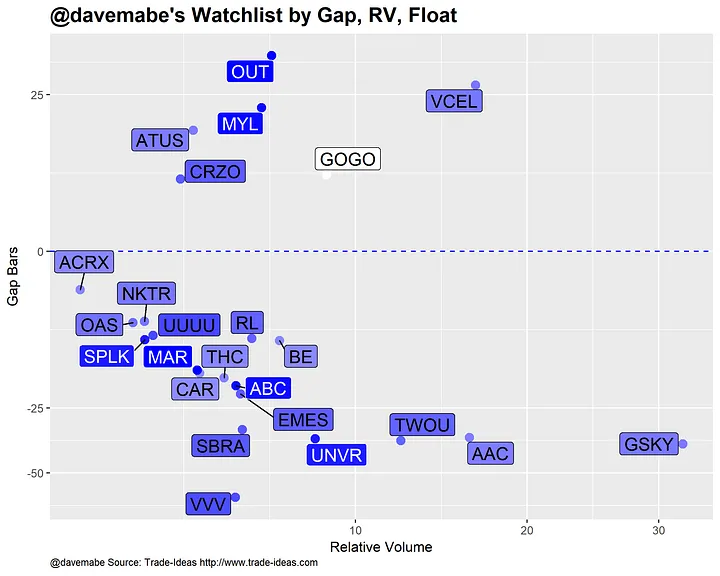
Take a look at this screenshot from my watchlist from yesterday:
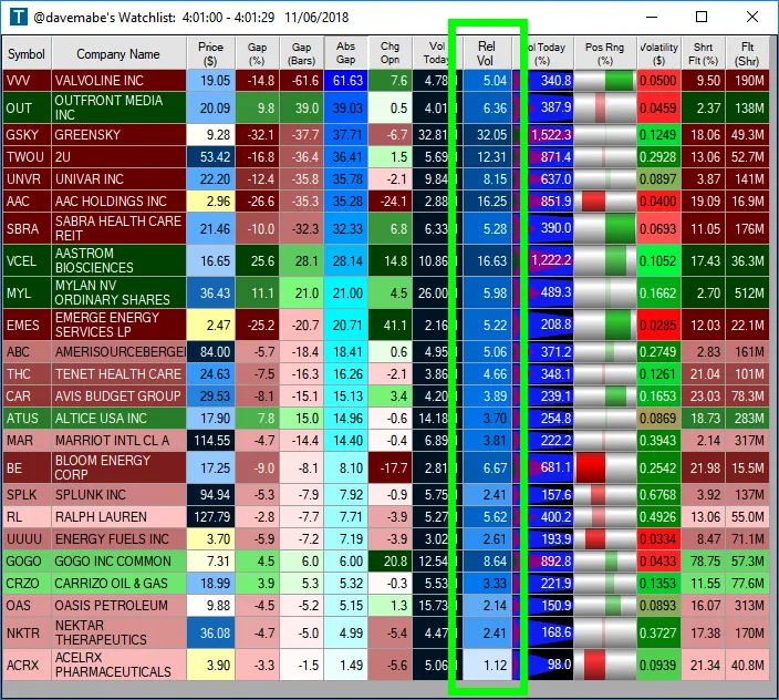
The color coding helps but it’s hard to quickly recognize that the relative volume for GSKY was twice as high as any other value in the list and the top 4 values (GSKY, TWOU, AAC, VCEL) were vastly higher than any other value.
My Initial Prototype
I wanted to create a view that lets you see the magnitude of the differences and gauge the order of the values without having to sort the column. Here was my first stab at a different top list view.
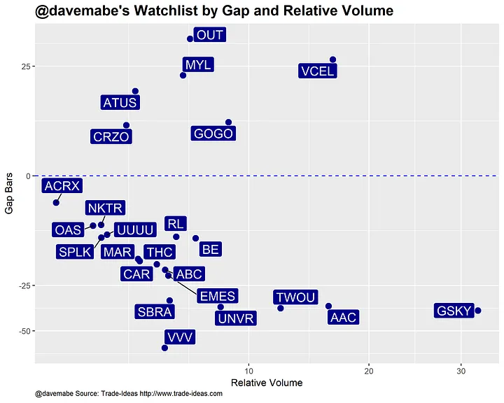
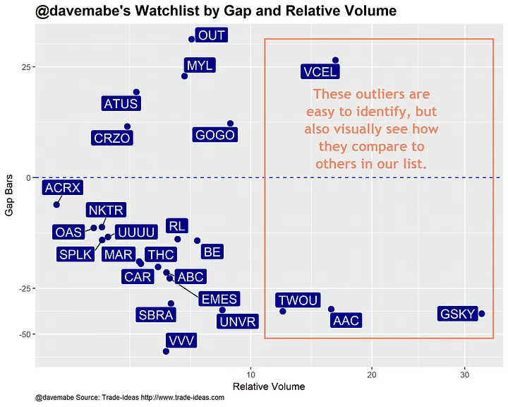
This is a scatter plot across two dimensions. In this case, the dimensions are Gap Bars and Relative Volume, two important values that I use in determining which stocks to trade and how to trade them. This view lets you visually see the four highest values in relative volume at a glance but also how extreme they are in terms of the gap.
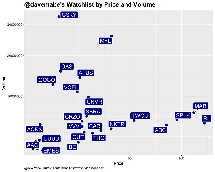
I chose Gap and Relative Volume for the X and Y axes, but you could choose any two columns from the top list. Here’s one with Price on the X axis and Volume on the Y axis:
But We Can Do Better
So far so good, but I think we can improve on this. We can add more dimensions to the view.
Here I’ve added a gradient color as the background of the labels based on the Float of the stock. The darker blue the label, the smaller the float. The lighter the label, the higher the float. You can quickly see that GOGO has the highest float in the list and OUT, MYL, SPLK, MAR, ABC, and UNVR have low floats relative to the list. The point shares the same background color as the label.
Final Prototype: A Four-Dimensional View
There’s one more dimension we can add: the size of the label. Here I’ve added the Position in Range as a parameter in the view. The closer the stock is to its high of the day, the larger the label is. For example, OUT is closer to its lows relative to VCEL which is closer to its highs.
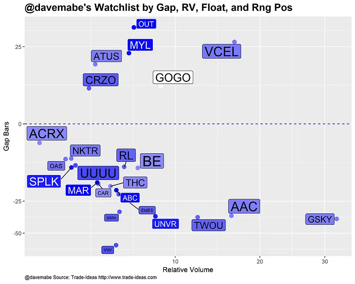
What we end up with is a visually appealing view of our top list across four different and distinct dimensions — completely customizable by using any combination of columns in the top list.
So what do you think? Any changes you would make? I’d love to hear from you.
(If you like the content here, you’ll love my free newsletter.)